About two months ago, I inquired on Twitter about whether anyone had created an open source version of the Twitter iPad user interface. Subsequently, I’ve seen three separate projects on GitHub that provide a great framework for you to build your own Twitter-like iPad interfaces. Today, we’re going to look at one of the projects I discovered and see how to build as nearly perfect a clone of the Twitter iPad UI1 as we can on top of it.
tl; dr
Here’s the GitHub repository necessary to make this

The StackScrollView project
We’ll be working with StackScrollView, which, considering all it can do, is a fairly simple project. You can go check out its Cocoa Controls page, or head directly to the GitHub repository.
StackScrollView was created by Raw Engineering, a web and mobile consulting company with offices in Mumbai and San Francisco.
Once you have cloned the GitHub repository, open up the xcodeproj file in Xcode and launch it in the simulator. You’ll see a left-hand navigation pane and slide-in table views similar in experience to the Twitter iPad app.

Today’s lesson
This post will walk through the following four topics:
- Basic look-and-feel changes.
- Rounded table view corners.
- Left navigation pane table cells, headers and footers.
- Incorporating the timeline.
Basic look-and-feel changes
First, let’s replace the background used in the StackScrollView project with the textured scroll view background color provided by Apple, and remove the vertical 1px white line on the right side of the navigation pane2.
Rounded table view corners
Next, let’s tackle the rounded corners that you’ll see on all the views Twitter pushes onto its stack. Luckily, there’s another project on Cocoa Controls that shows exactly how to do this. Jeremy Collins’ RoundedUITableView project shows how to duplicate the experience of Apple’s Weather app, which also happens to work perfectly for our needs.
Now that we have added the RoundedUITableView class to our project, we need to make use of it. It’s not quite drop-in-and-go, but it’s close.
In DataViewController.h, add a forward class declaration for RoundedUITableView and change the _tableView instance variable’s type.
Meanwhile, in DataViewController’s implementation file, #import "RoundedUITableView.h" and adjust the instantiation of the table view accordingly. While you’re in here, change the table view’s background color from clear to white; otherwise, it’ll look strange when we finish!
Things wouldn’t look quite right if you tried running the project right now; the table view would still have square corners. To fix this, we need to modify one of the -init methods in RoundedUITableView. You’ll notice that DataViewController calls -initWithFrame:style: on RoundedUITableView, but RoundedUITableView doesn’t explicitly handle this. Open up RoundUITableView.m and adjust the method signature for -initWithFrame: to include a style parameter, and add the corresponding parameter to the call to its superclass.
Finally, we need to get rid of the default background color set in StackScrollViewController.m. This is easy, just remove the backgroundColor setter call on line 665.
Taking stock of our accomplishments, and some bug fixes
We’ve accomplished quite a bit without having to do a lot of work. Of course, a couple minor issues have already creeped in:
- Incorrect corner radius – The corner radius on our stacked view controllers is slightly off. Eyeballing it makes it look like the corner radius should probably be 6 instead of 10.
- Subordinate stacked view controllers should have square left edges – If you look at screen shots of Twitter for iPad you’ll see that secondary (and tertiary) stacked view controllers’ left edges are square. This is a minor detail, but it’s still an important one.
Fixing the corner radius problem is extremely straightforward. To do this, I defined a preprocessor macro called kCornerRadius that I set to the value of 6, and then used that instead of directly setting corner radius values to 10.0 as our code did before.
Square left edges are a bit tricker to do. As a first step, let’s add a property to the RoundedUITableViewMask class that determines whether or not it should draw all rounded corners, or square+rounded corners. Since we’re doing all of our corner masking manually, it turns out that the cornerRadius property in -setupView can be removed. Finally, we’ll modify our -drawRect: method to draw the correct set of rounded or square corners, depending on the circumstance.
Putting it together
Let’s put our new-found ability to draw proper corners to good use. We’ll plumb the squareCorners property through all of the relevant classes. It’s not the most architecturally elegant solution—and it won’t scale very well once we start adding new types of view controllers to the app—but it’ll do well enough for the moment.

Left navigation pane table cells
Before we go any further, I just noticed that the background color for our app is wrong. Twitter uses the textured scroll view background color, but they darken it up significantly. We can easily mimic this effect by changing the backgroundColor of RootViewController to [[UIColor scrollViewTexturedBackgroundColor] colorWithAlphaComponent:0.5] on line 99.
We’ll use icons from the (really spectacular) CC BY-licensed Glyphish icon set for the navigation pane. It doesn’t have everything we need, but it’s good enough for our purposes here. Once we have our icons, we’ll lay some groundwork for our cells.
There will be exactly six cells in the navigation pane:
- Timeline
- Mentions
- Lists
- Messages
- Profile
- Search
To this end, it’s easiest for us to create and populate an array that will store all of the information necessary for filling-in our cells. We’ll add an NSMutableArray called _cellContents to MenuViewController.
Before we start working on our pixel-perfect replacement for UITableViewCell, let’s take a second to make sure everything works as expected, and check in the changes we’ve made.
Subclassing UITableViewCell
Creating custom, properly functional subclasses of UITableViewCell can be a huge pain in the ass. I’ve been doing iOS development professionally since 2008, and parts of this still trip me up! To make things easier, we’ll reuse as much of the default UITableViewCell as we can. This means that instead of specifying new views, we’ll move the already-provided textLabel and imageView controls around a bit.
Additionally, we’ll need to add new UIViews to represent the 1px lines at the top and bottom of each cell, and a UIImageView to represent the ‘glow’ effect seen when you have new tweets in your timeline, new direct messages, etc.
The contents of the table view cell should be pretty self-explanatory. The one point that is worth highlighting is that I re-layout textLabel and imageView in the -layoutSubviews method. This is the proper place in a UITableViewCell subclass to modify this sort of thing, and the only place to do it if you’re editing the layout of views provided to you by the superclass.
Finally, the exact width of the imageView was determined by the need for the stacked view controllers to cover everything but the cell’s image.
Additionally, we’ll need to make some modifications to the table view controller in which we’ll be displaying these cells:
Also, here’s a quick look at how the UI for the app is progressing with our new table cells (nice icons, eh?3):
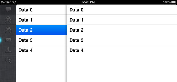
Table Section Header
In order to complete the navigation pane experience, we’ll need to add two more things to our table:
- A custom table section header view
- A watermark footer
We’ll tackle the section header first. To get started, we need to implement two new UITableViewDelegate methods in MenuViewController:
- (CGFloat)tableView:(UITableView *)tableView heightForHeaderInSection:(NSInteger)section
and
- (UIView *)tableView:(UITableView *)tableView viewForHeaderInSection:(NSInteger)section
The implementation for -tableView:heightForHeaderInSection: is easy: just return the value 70.
-tableView:viewForHeaderInSection: is not quite as easy. We’ll be best off by creating a custom view. Let’s look at what we know about it:
- Fixed size of 200×70px.
- User avatar picture of size 48×48px at (11,11) from the view’s origin (i.e., the top left corner).
- User avatar picture has a cornerRadius of 3px.
- User avatar picture has a drop shadow.
- A text label with the user’s account name. Design-wise, it looks identical to the rest of the text in the navigation pane, except that the font size looks like it’s probably
labelFontSize.
So, let’s build another custom control! We’ll call this MenuHeaderView. This control works pretty much the way you’d expect it to:
Note that, for now, the drop shadow and cornerRadius are mutually exclusive. We’ll show the drop shadow for now and revisit this issue later on.
Watermark Footer
In order to complete the look-and-feel of the navigation pane, let’s add the watermark footer. This will be another simple custom view. It needs to have a top line of the same semi-transparent white color we’ve used elsewhere, and then our logo centered underneath. Compared to some of the other stuff we’ve done, this should be a piece of cake:
Lastly, we need to hook our new watermark footer view into the navigation pane’s table view. Only a two line change, including the #import!
OK, we’re getting pretty close to the end, now. Let’s take another look at how our user interface is progressing. Looking good! 4

Incorporating the timeline
Alright, we’re on the home stretch: we need to pull in our timeline and render it in the table in the center. For the purposes of this demonstration, we’ll eschew asynchronous network operations and instead load some data from a plist file that’ll be sitting in the project5.
Creating the TweetTableViewCell
Our TweetTableViewCell will be another subclass of UITableViewCell, and it’ll have four relatively self-explanatory properties:
imageViewauthorLabeltweetLabeltimestampLabel
Creating the cell and laying out its contents isn’t much different from what we’ve seen before, except for one new wrinkle: since tweets can differ from each other in length, it isn’t possible to predict how tall the cell that contains one should be in advance. Instead, we’ll have to adjust the heights of our cells at runtime.
To accomplish this, we’ll need to add two new methods to our app:
-tableView:heightForRowAtIndexPath:inDataViewController, and+heightForTweetWithText:inTweetTableViewCell.
-tableView:heightForRowAtIndexPath: is a method on UITableViewDelegate that allows its UITableView to figure out how tall a given cell should be. In our case, we determine the height of a TweetTableViewCell by calling +heightForTweetWithText: and return its value.
+heightForTweetWithText: is also relatively straightforward, albeit hardcoded:
We calculate the size of each fixed element of the cell. Then, we determine the size of the tweet’s body given our desired font with the NSString category method -sizeWithFont:constrainedToSize:lineBreakMode:. Finally, we truncate the value into an int (in order to avoid problems with nasty, blurry text that can occur when you try rendering a string at a non-integral point on the screen).
Et voilà, we have rows of differing heights!
The last thing we’ll need to do to these cells is get the timestamp working properly. We’ll start by filling in the details for the timestampLabel property on the TweetTableViewCell, and then get into the heart of the matter: providing relative timestamps to the cell from the controller.
To accomplish this task, we’ll turn to a category on the NSDate class called DistanceOfTimeInWords. This category lets us transform an NSDate into a string like “About 5 hours ago.” To use this category in our project, we’ll first need to grab the relevant files from GitHub and add them to the project. Second, follow along with this diff to see how we can translate the NSDates into meaningful relative strings:
Here’s the gist6:
- Add a new instance variable to the header file, creatively named
formatter. - Initialize the formatter, provide it with a locale, and—most importantly—call its
-setDateFormat:method with a bit of Unicode date formatting voodoo7 conveniently found on Stack Overflow. - Convert each tweet’s
created_atstring value into anNSDateobject using the-dateFromString:method onformatter. - Assign the result of
-distanceOfTimeInWordsto thetimeStampLabel'stextproperty.
Rather important note: NSDateFormatters aren’t particularly cheap to create so, if this was a piece of production code, I’d probably modify -distanceOfTimeInWords to accept a date formatter as an argument so that it wouldn’t need to keep creating new ones on every pass through -tableView:cellForRowAtIndexPath:.
Wrap-up
And, hey, look at that: we’re done! We’ve come a long way in terms of look and feel since we started, but it certainly wouldn’t have been possible to get here without all of the awesome, freely available components we were able to leverage:
Of course, you can retrieve the completed project from my personal GitHub account.
Please let me know what you think about this, either on Twitter or in the comments below. I’d love to extend this series with a part 2 if sufficient interest exists!

1 Imitation, flattery, etc.
2 We’ll eventually have to replace this with an etched 2px line, but that can be dealt with later.
3 Let’s be honest: the changes I made to the icons aren’t particularly nice. I’m a software developer and something of a user experience control freak, but not a graphic designer.
4 Except for the graphic design of the watermark, but we’ve already established my deficiencies in that area.
5 Although it is worth mentioning that the way I created this plist file is kind of neat. I love Ruby for this reason…
6 Ha, I kill myself sometimes.
7 I have written many Unicode date format strings without assistance from SO, and it’s never been an experience I relish.